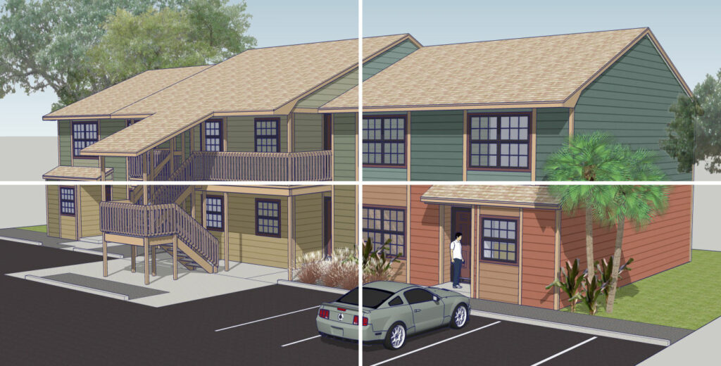
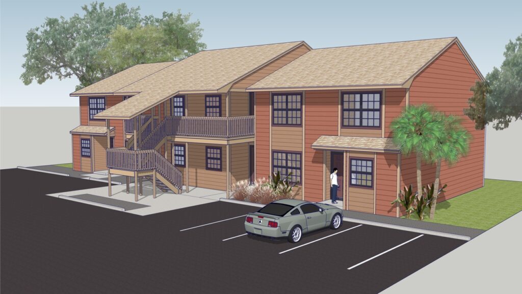
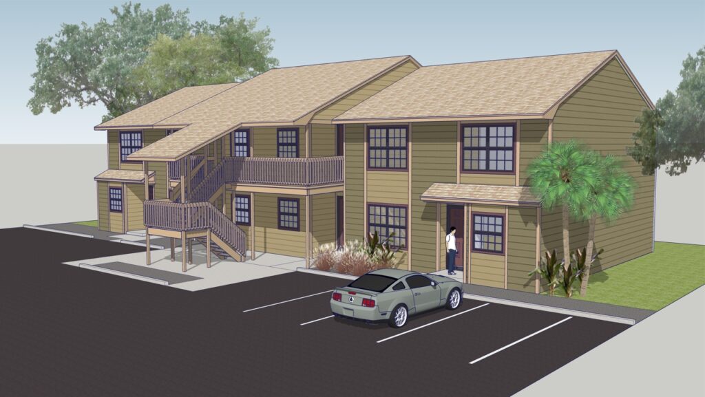
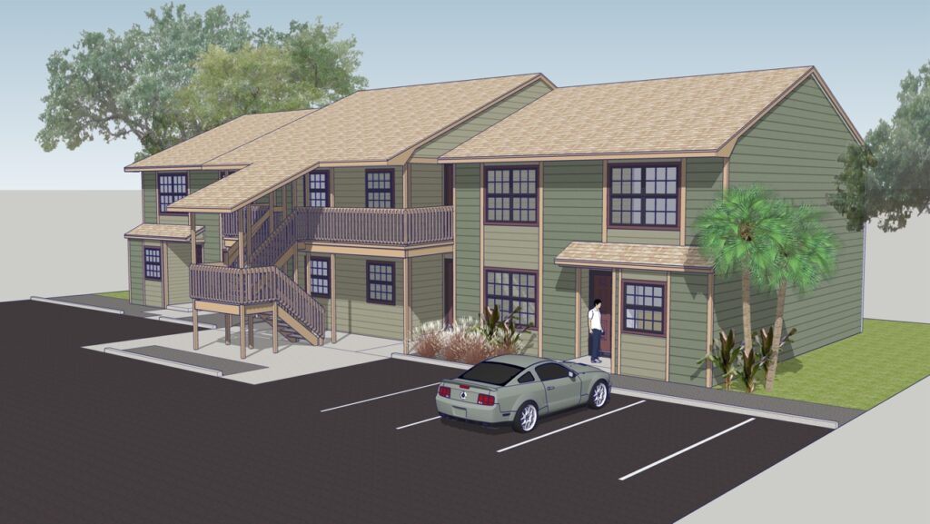
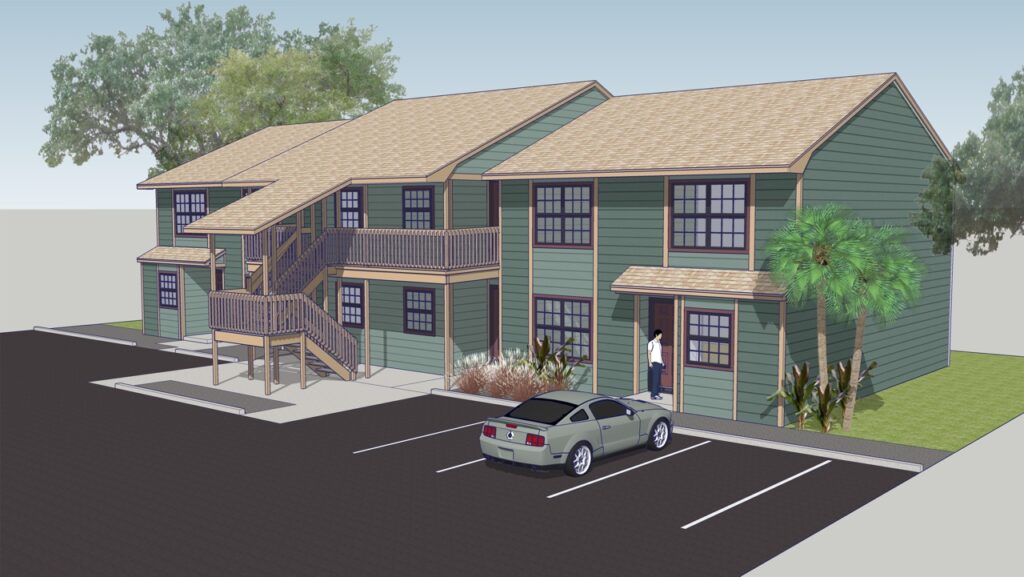
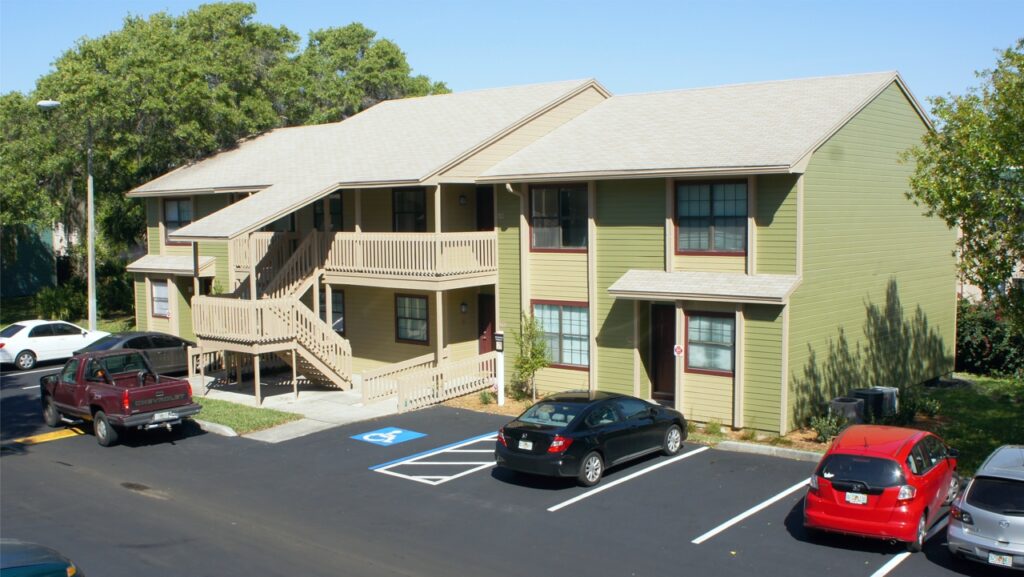
Originally conceived as cottage-style condominiums, the Amberton Apartments had been positioned as an Urban/Caribbean style product without much success. Aside from a lack of context-enhancing landscape, the color program paid no heed to the morphology of the architecture, immutable contextual component considerations, or color harmonies, nor the urban context and key demographics or addressable adjacencies of colleges and hospitals.
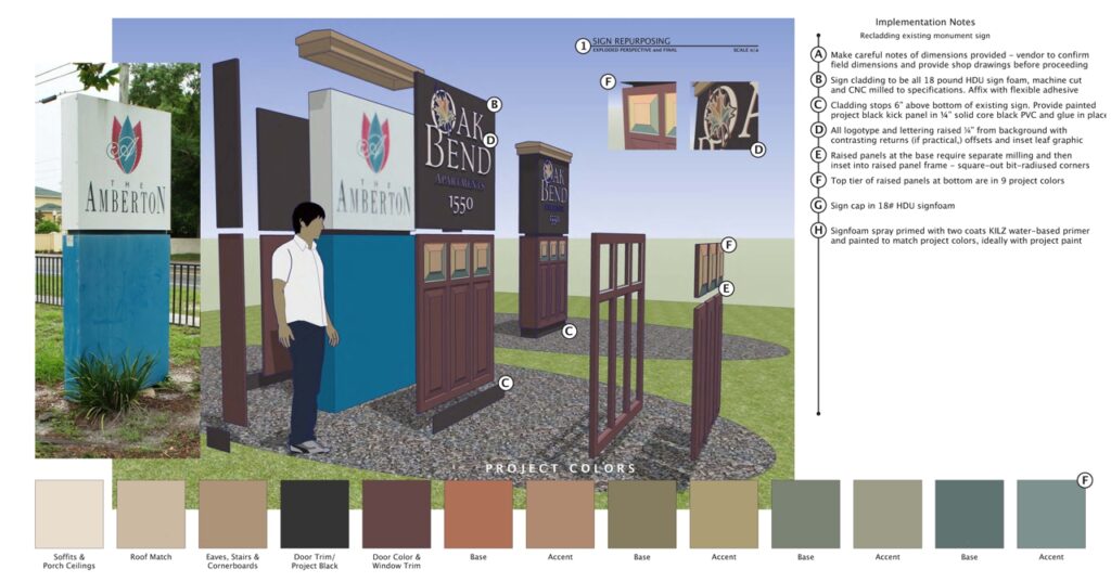
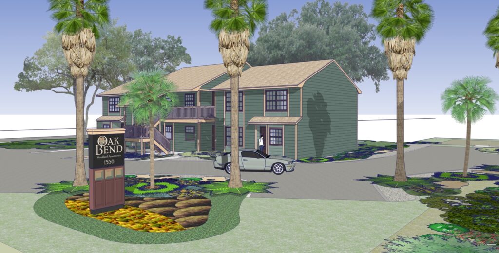
Services included a thoughtful and strategic Color Consulting, Renaming, Re-branding, Brand Communications, Amenity Design and Landscaping, focused on key demographics. The color program was a four colorway repeat, at once respectful of the neighborhood and tastefully implemented.